
When I first started building Polka Dot Teapot Studio, quite honestly, I was overwhelmed.
I had a million things on my to-do list (some of which I wasn't even aware of until I actually started building!). Creating a website with nothing but a domain name and a WordPress account, setting up email marketing, rebranding my socials... the list went on. And it still does
One of those early jobs was creating a welcome email automation for anyone who signed up to my mailing list. At the time, I was in the very early stages of developing my website and branding, and I was still figuring out exactly what I wanted the studio to be.
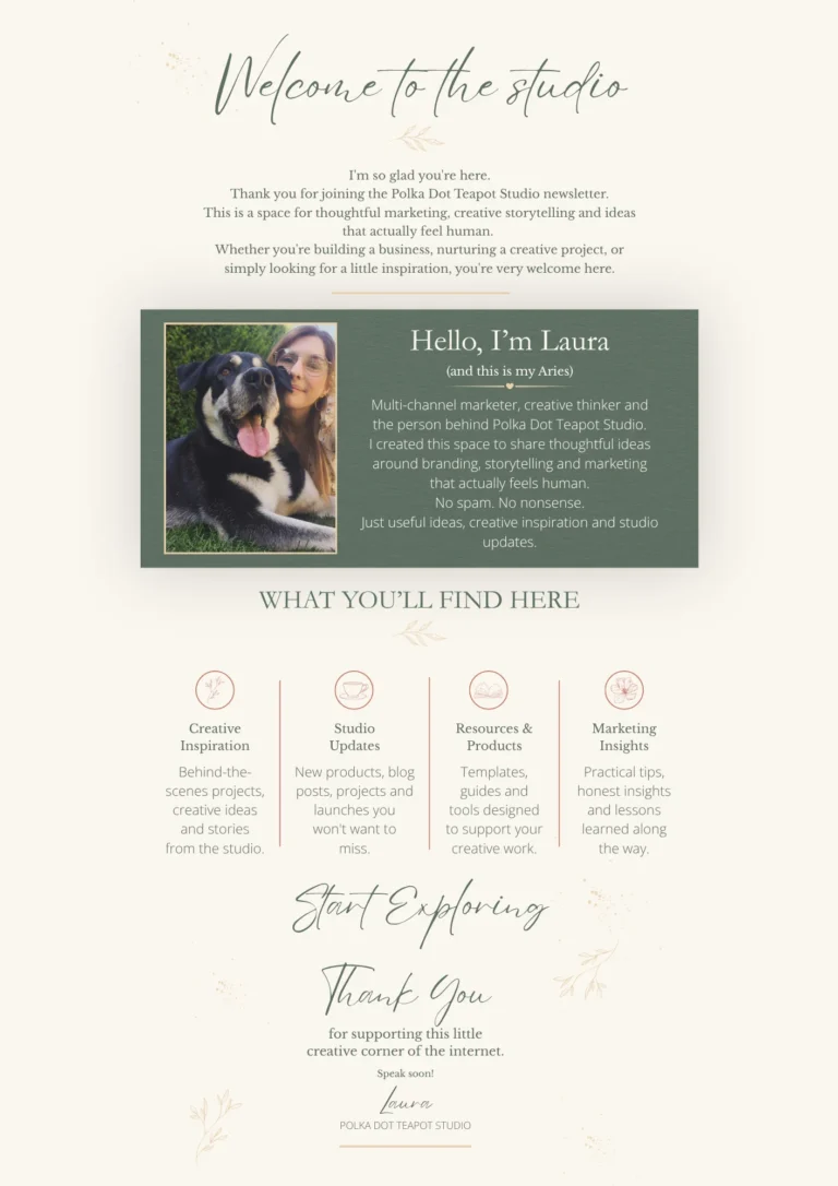
I knew I wanted my welcome email to feel friendly and personal, explain a little about me and what I did, and give people the opportunity to explore the website. I also wanted to come across as a human rather than a faceless brand. Hence the photograph of me and Aries, my rather unhelpful studio assistant. And initially, I was quite pleased with it!
But as the studio developed, so did my branding, website and the way I wanted to communicate with people.
The turning point came when I started developing my first monthly studio newsletter. I wanted something fresher, cleaner and easier to read. I was so pleased with how the newsletter turned out, but then it occurred to me that my original welcome email was looking a little dated.
Even though it had only been a few months!
It wasn't terrible. It just wasn't quite in line with the direction I wanted to take the studio.
So, we had a little makeover.
The original email already had some lovely elements I wanted to keep. It introduced me, explained what I did and linked to different sections of my website. I didn't want to throw all of that away. It just needed a little facelift.
I wanted the design to feel more connected to my website, improve the layout and make the copy reflect the cleaner, more developed version of Polka Dot Teapot Studio.
Here's what I changed, along with a few things worth considering if you're creating or refreshing your own welcome email.
I know this sounds super obvious!
However, when someone signs up to your mailing list, it's worth considering what the first thing they hear from you actually says.
Are you immediately trying to sell them something? (I don't personally recommend leading with a sales pitch.) Are you launching straight into a list of products and services? Offering a discount code as a thank-you for signing up? Or are you taking a moment to welcome them?
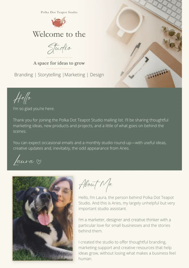
I wanted my welcome email to feel like a little letter, so I added a dedicated introduction with a simple hello, a thank-you for subscribing and an explanation of what I'll be sharing.
It's a small change, but it gives subscribers a clearer idea of what they've actually signed up for. Whether you're sending monthly updates, useful advice, new products or the occasional special offer, let people know what they can expect.
A little clarity goes a long way.
One of the biggest reasons I wanted to revisit my original welcome email was the design.
Since creating it, I'd spent a lot of time refining my website, improving my product photography and developing a more consistent visual style across the studio.
The old email still had my colours, typography and illustrations, but it was beginning to feel a little crowded. I knew I could bring everything together more effectively.
For the redesign, I created a brand-new header, introduced stronger colour blocks to separate sections and developed a layout that felt more connected to my website, social media and other email content.
I also updated the buttons to match the style I've been using elsewhere. I didn't want every email to look identical. I just wanted them to feel like they belonged to the same business.
Your emails are an extension of your website. Familiar colours, typography, imagery and button styles can help create a recognisable experience, even when the layouts change.
They don't have to be twins. Just obviously related.
One thing I knew I wanted to keep was the photograph of me and Aries. Firstly, because he's my best boy and I love him. Secondly, because it shows the human behind the business. I'm a small business owner, not a large team. And who doesn't love a cute puppy? Or, in this case, a distinguished older gentleman.
My original introduction was lovely, but I decided to rewrite it to reflect the work I'm doing now and the direction the studio has taken. I also introduced Aries as my largely unhelpful but very important studio assistant. Which is a very accurate statement, and I do not take it back.
The new introduction explains a little more about me, my love of small businesses and why I created the studio in the first place. Not every business needs a photograph of its owner and their dog, of course. But a little personality can make an email feel much less anonymous.
You don't have to share your entire life story. A short introduction about what you do and why, or a genuine photograph, can help people get to know the business they've subscribed to.
My original welcome email had a section explaining what subscribers could expect, with the information divided into four narrow columns, each with a little illustration and description.
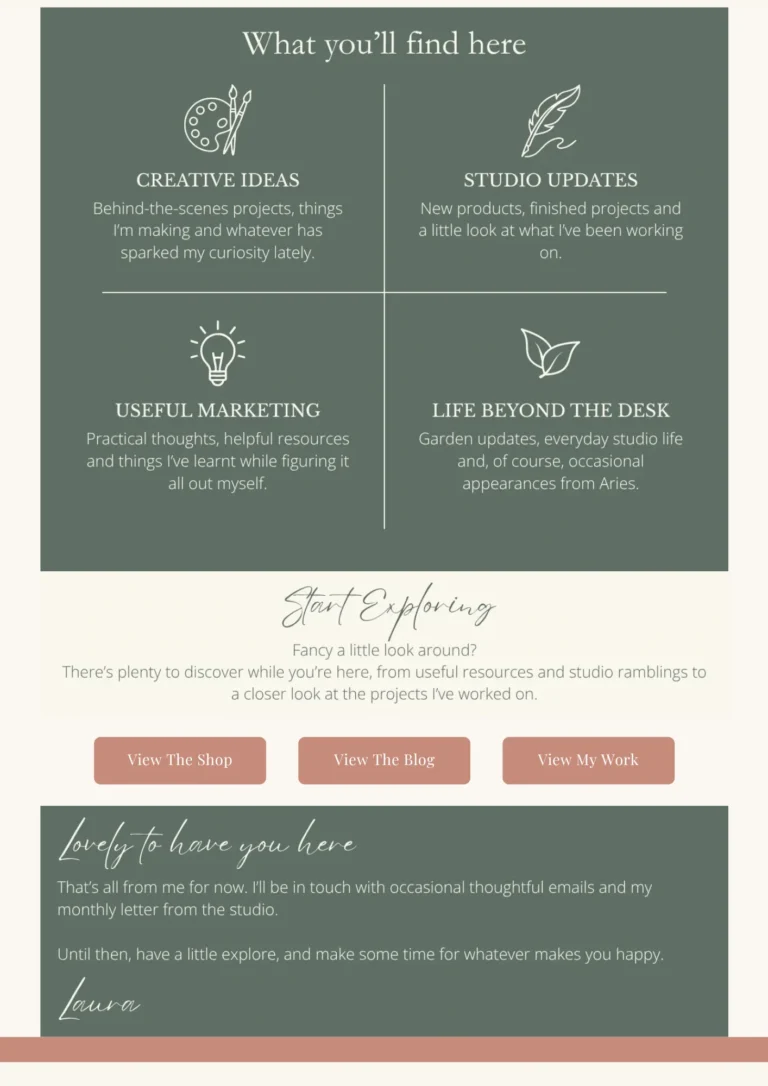
The idea was nice, but everything needed a little more breathing room. The new version uses a two-by-two layout with larger illustrations and clearer sections.
I also updated the content itself. Alongside creative ideas, studio updates and useful marketing, I introduced a new section: Life Beyond the Desk. Because, as anyone who's read my recent studio round-up will know, there's usually a little garden update or an Aries section somewhere along the way.
The layout is different, but the purpose is the same: helping people understand what they'll find in my emails.
Your content should be easy to scan. Clear headings, short paragraphs and enough space between sections can help readers find the information they're interested in.
And don't forget to check how everything looks on a phone, too!
A welcome email doesn't need to end with a sales pitch. Sometimes, it's simply an opportunity to help someone discover a little more about your business.
My original email included three buttons linking to my products, blog and projects. I decided to keep those destinations but give the section a friendlier introduction and update the calls to action.
The buttons now match my website styling, and the copy invites subscribers to have a look around rather than pushing them towards a purchase. Some people might be interested in reading a blog post, others might want to browse my shop, and some may want to look at my portfolio.
Giving people a few clear options means they can choose what interests them.
Think about what someone might naturally want to do after reading your email. One or two useful links might be all you need. If you offer several options, make sure they're clear and relevant.
One thing I'm happy to hold my hands up and admit is that I sometimes struggle with change.
Well, not necessarily change itself. More the commitment and consistency side of things. Once I've committed to a particular font or colour, I sometimes worry that changing it means my branding won't be consistent anymore.
Will people still recognise my business? Do I now need to go through the entire website and change every little detail to match?
But choosing a particular design element in the beginning doesn't mean you're stuck with it forever. Sometimes, a refresh is a good thing. As long as other elements remain recognisable, such as your tone of voice, personality and overall visual identity, changing an accent font isn't going to make people instantly forget your brand.
Nobody is scrolling through your website, horrified that a blog post card from six months ago has a slightly different font from one you published last week.
At least, that's what I'm telling myself anyway.
Your branding can be consistent without being completely rigid. And as your business grows, it's perfectly reasonable for the way you present it to evolve, too.
Looking back, I'm glad I created that original email when I did.It gave me somewhere to start and already contained many of the things I still value in my business.
The redesign wasn't about fixing something that was wrong. It was about recognising that the studio had changed and allowing my welcome email to grow alongside it.
If you've had the same welcome email running quietly in the background for a while, it might be worth opening it up and having another look.
Does it still reflect your business? Is the information up to date? Does it look right on mobile? And, most importantly, does it still feel like your business?
It might only need a few little tweaks. Or you might end up giving yourself an entirely new design project, like somebody I know.
Either way, your welcome email is a lovely opportunity to make a thoughtful and lasting first impression.
Want to create a welcome email but aren't quite sure where to start?
If you'd like a hand putting together something lovely, personal and welcoming for your business, you can explore my email marketing services here.