
St Nicholas Lodge No. 2259 is a long-established Freemasons’ lodge based in Thorne, South Yorkshire. Founded in 1888, the Lodge brings together members from across the local community through friendship, charitable support, tradition and shared values.
This trifold leaflet design was created to give St Nicholas Lodge a professional and welcoming way to introduce itself to prospective new members.
As the first leaflet of its kind produced by the Lodge, it needed to explain Freemasonry clearly, encourage people to find out more and still feel respectful of the Lodge’s history and identity.
St Nicholas Lodge wanted an introductory leaflet for people who may know very little about Freemasonry or feel unsure about making initial contact.
The original information was detailed and useful, but there was far too much to fit comfortably into a six-panel leaflet. The challenge was to identify what a prospective member genuinely needed to know, simplify the language and organise everything into a clear and approachable structure.
The finished design needed to feel established without being dated, informative without becoming overwhelming, and welcoming without losing the sense of tradition that was important to the Lodge.
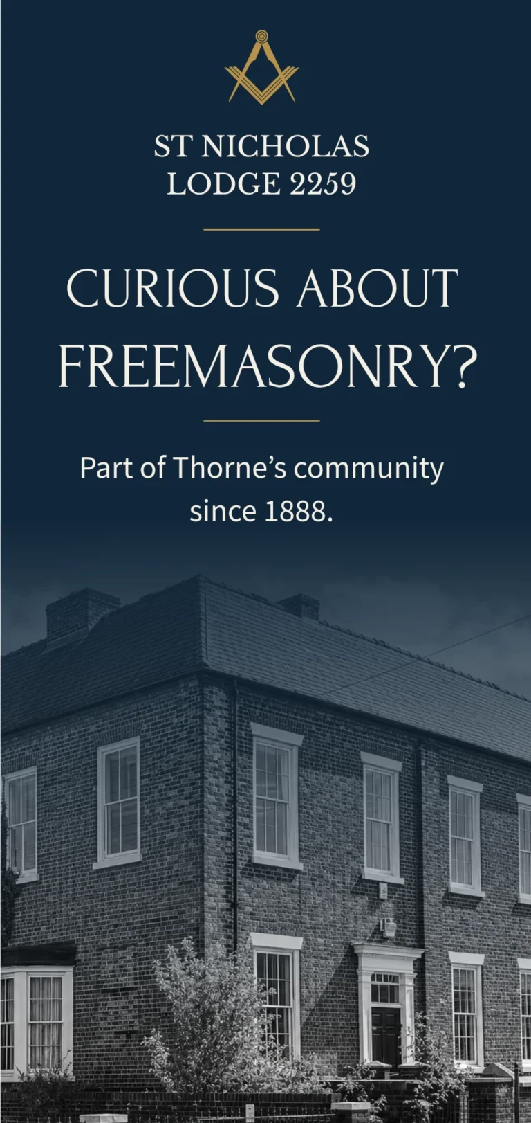
The visual identity was built around a rich navy, warm cream and muted gold colour palette.
These colours gave the leaflet a traditional and refined feel while providing enough contrast to create a clear visual journey across the different panels.
Black-and-white photography of the Lodge building and interior added a strong sense of history and place.
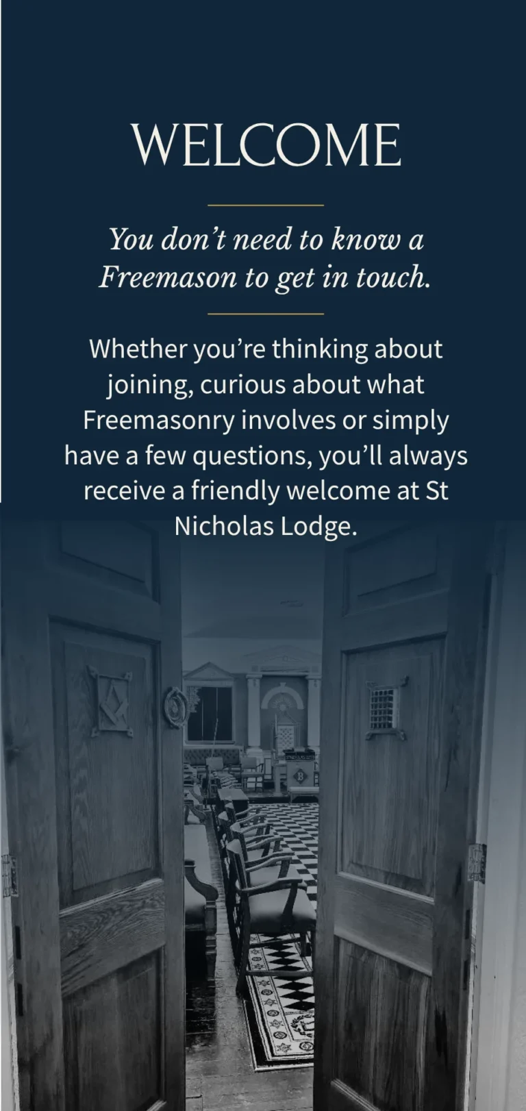
An image looking through the open Lodge doors became a central part of the design, creating a natural feeling of invitation and reinforcing the message of a warm welcome.
Elegant headings were paired with clean, readable body text, while fine gold lines and carefully balanced spacing helped connect each section without making the design feel overly decorative.
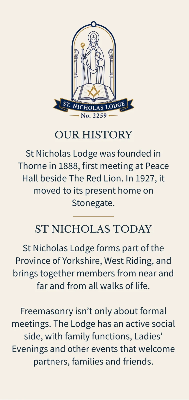
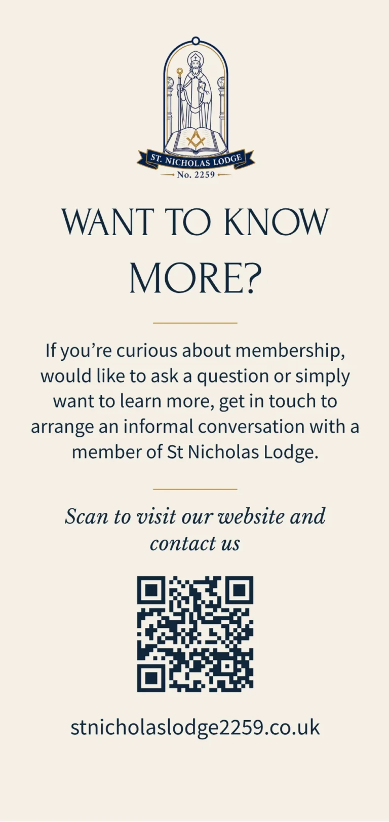
The existing St Nicholas Lodge crest was also incorporated into the leaflet, with the wider colour palette chosen to complement its navy and gold details.
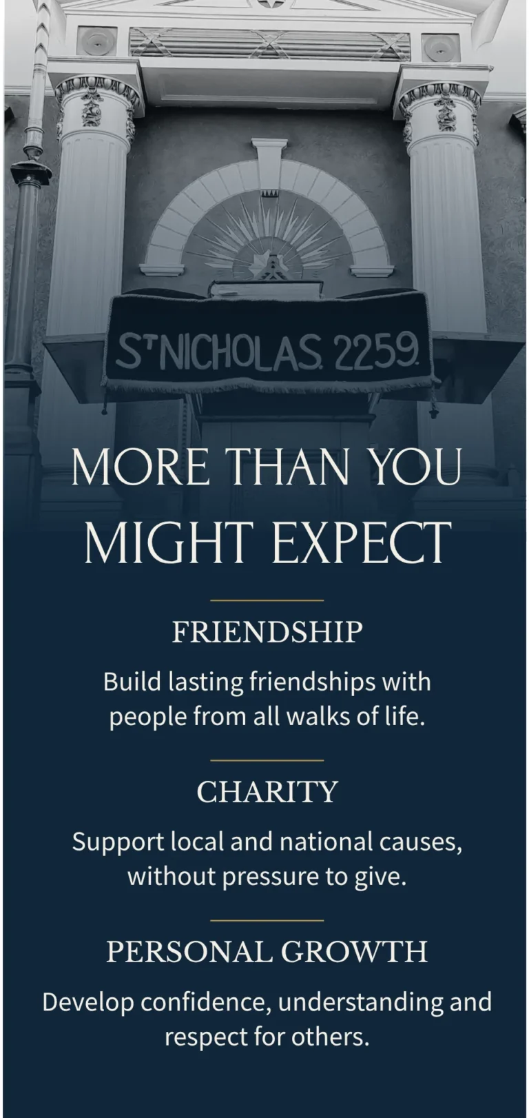
A significant part of the project involved refining and restructuring the content.
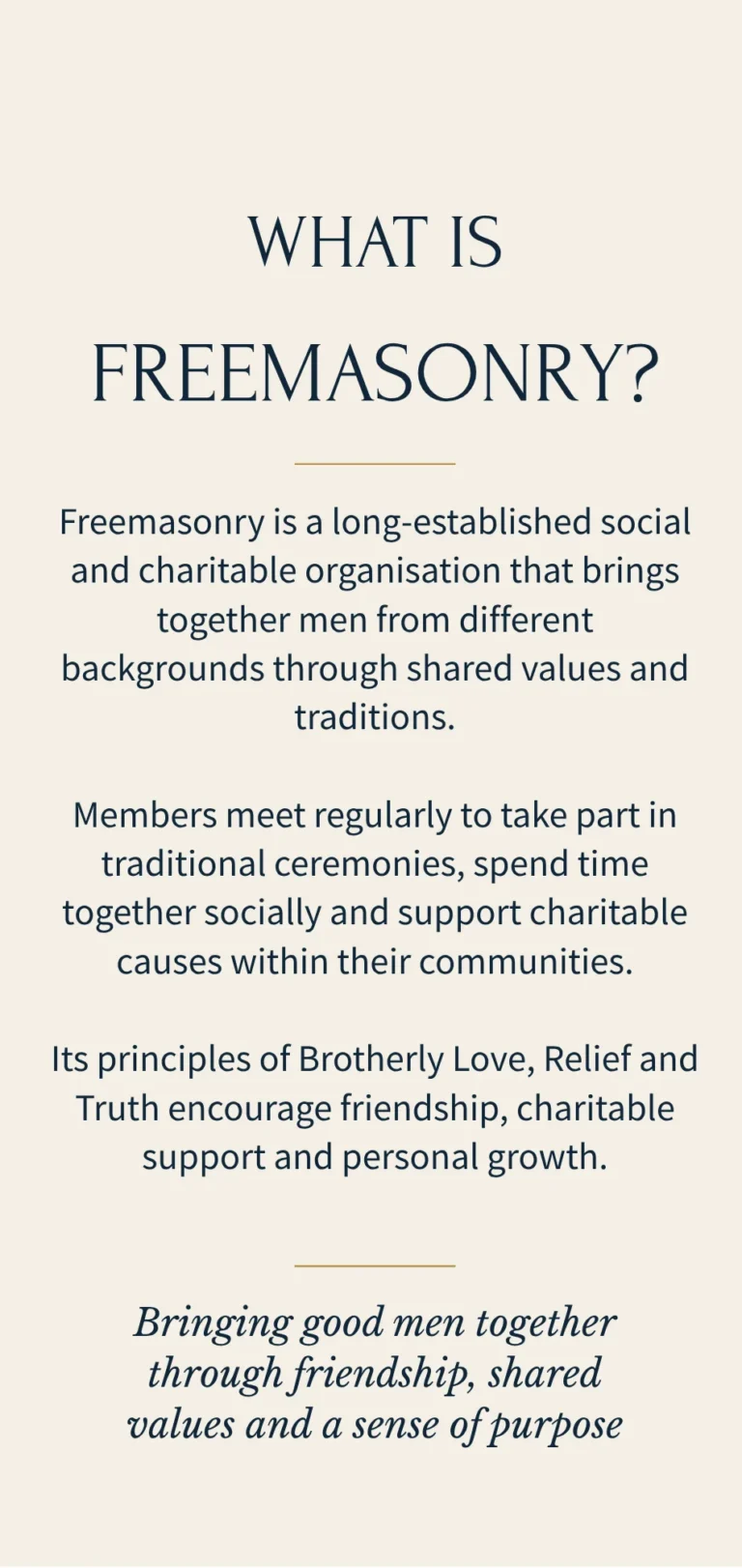
Lengthy information about Freemasonry and the history of the Lodge was condensed into shorter, more approachable sections. The wording was carefully considered so that it would speak directly to someone thinking about joining, rather than assuming that the reader already understood Masonic terminology.
The content was organised around:
-What Freemasonry is
-The history of St Nicholas Lodge
-The Lodge’s role within the local community
-Social occasions, family functions and Ladies’ Evenings
-How prospective members can find out more
A QR code and website address were included on the contact panel, giving readers a simple next step without overcrowding the design with additional information.
Creating an A4 trifold leaflet meant considering how the design would work both as a complete flat layout and as a folded piece.
Each panel needed to work individually while still feeling connected to the others. The front cover introduced the Lodge, the inner panels explained Freemasonry and its values, and the remaining sections shared the Lodge’s history and encouraged further contact.
The alternating navy and cream panels helped separate the different types of information while maintaining a consistent visual identity throughout.
Particular attention was given to the order in which the panels would be seen as the leaflet was opened. This allowed the content to unfold naturally, moving from initial curiosity through to a clearer understanding of the Lodge and an invitation to get in touch.
The finished leaflet gives St Nicholas Lodge a professional and engaging way to introduce both the Lodge and Freemasonry to prospective members.
It transforms a substantial amount of information into something clear, approachable and easy to navigate, while the traditional colour palette, historic photography and Lodge crest retain a strong connection to the organisation’s heritage.
Most importantly, the leaflet opens the conversation in a friendly and reassuring way: You don’t need to know a Freemason to get in touch.
On behalf of St Nicholas Lodge No. 2259, I would like to express our sincere thanks to Laura for the excellent work she has done in designing and producing our new “Want to Know More About Freemasonry?” leaflet.
This was the first leaflet of its kind produced by St Nicholas Lodge, so it was particularly important to us that we got it right. We wanted something that would present Freemasonry in a fresh, welcoming and accessible way, whilst still respecting the traditions and identity of our Lodge.
Laura took the time to understand exactly what we were trying to achieve and turned our initial ideas into something far better than we could have envisaged. Her creativity, attention to detail and ability to bring everything together have resulted in a finished leaflet of which we are extremely proud.
Throughout the process Laura was patient, professional and very accommodating of our thoughts and amendments. Nothing was too much trouble, and it was clear that she genuinely cared about producing something that was right for us.
The finished leaflet has given St Nicholas Lodge a professional and engaging way of introducing ourselves and Freemasonry to prospective new members, and we have been delighted with the response to it.
We would have absolutely no hesitation in recommending Laura and Polka Dot Teapot Studio, and we very much look forward to working with her again.
W. Bro. Harry Richards
Worshipful Master
St Nicholas Lodge No. 2259
This was such an interesting project to work on. I really enjoyed learning more about Freemasonry and finding a way to present a traditional subject in a style that felt fresh, open and welcoming.
There was a careful balance to find between respecting the history and identity of the Lodge and creating something accessible for people who may know very little about Freemasonry.
Seeing everything come together, and hearing how proud the members were of the finished leaflet, made this an incredibly rewarding project to be part of.
Whether you need to introduce your organisation, explain a service or turn a large amount of information into something clear and easy to use, I can help you create a thoughtful leaflet that feels true to your identity.
Find Out More