
This project involved a full rebrand and website rebuild. It marked the transition from Polka Dot Teapot Designs into Polka Dot Teapot Studio. The aim was to move away from a product-based, highly visual brand.
Instead, the focus shifted towards a more refined and intentional space. This new direction centres around branding, storytelling, and marketing support for small businesses.
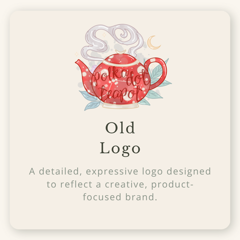
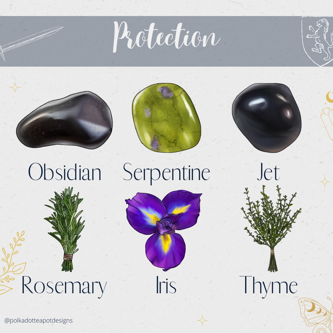
The original logo reflected a creative and expressive identity. It also carried a slightly whimsical feel. With hand-drawn elements, polka dot detailing, and layered illustration, it captured the playful nature of the products being created.
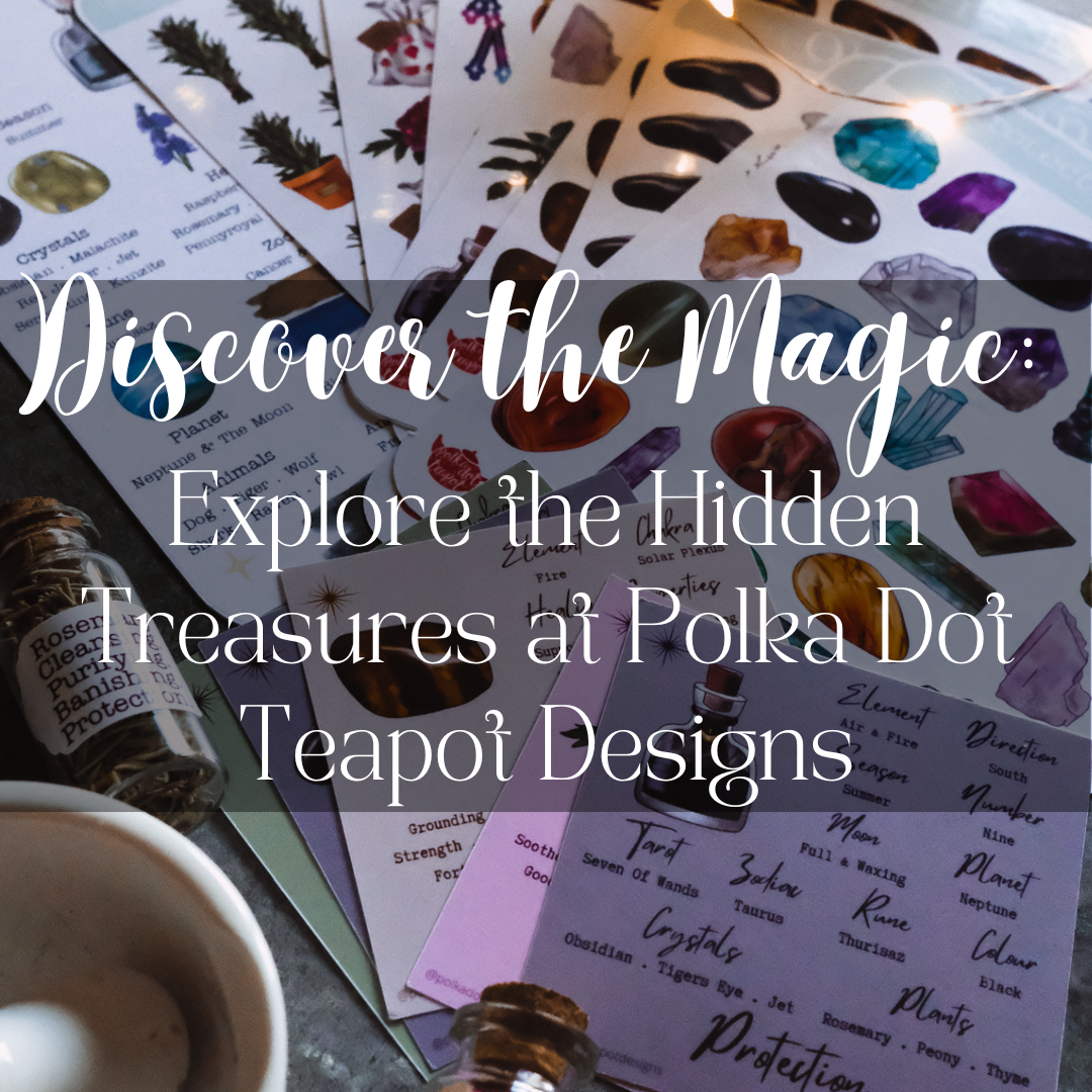
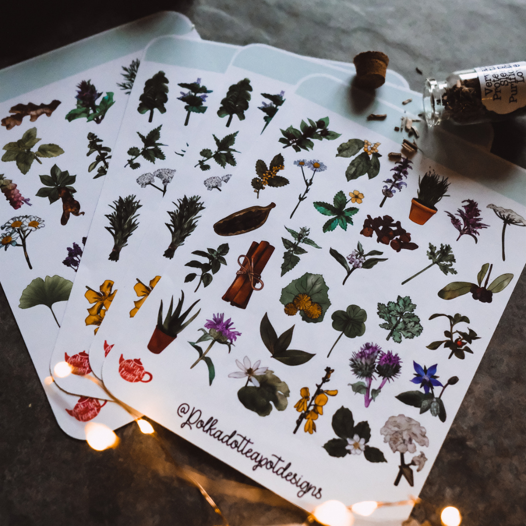
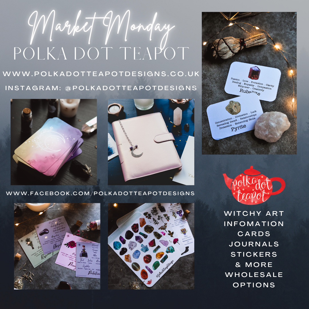
The brand focused on metaphysical artwork and digital products.
These were designed primarily for small businesses within a creative and spiritual niche.
Visually, this was reflected through:
-Rich, deeper colour palettes
-Intricate and detailed illustrations
-Decorative typography and layered compositions
After stepping back from the business for a short time, I returned with a fresh perspective.
I also had new ideas and a clearer understanding of the direction I wanted to take. During this time, I completed a multi-channel marketing apprenticeship.
As a result, I developed my skills across content creation, branding, email marketing, and digital strategy. Because of this, my approach to the business evolved.
It became less product-focused and more strategic. I gained a deeper understanding of how branding, storytelling, and marketing work together.
This shift made it clear that the existing brand no longer reflected the direction of the business. As a result, I carried out a full rebrand and website rebuild.



Polka Dot Teapot Studio was created to reflect a more considered and strategic approach.
It now focuses on branding, storytelling, content creation, and design for small businesses. The visual identity was redesigned to support clarity and flexibility.
At the same time, it introduces a more professional and intentional positioning.
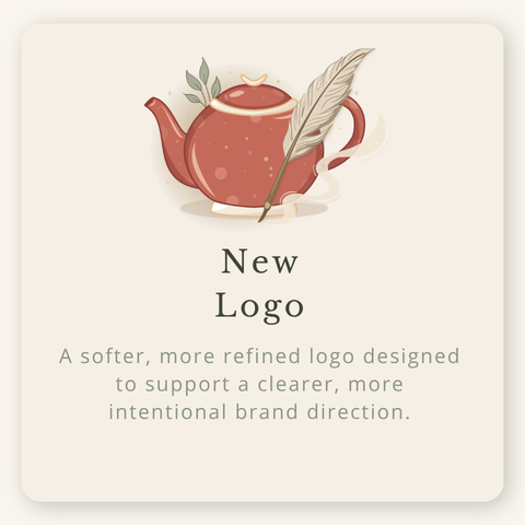
Simplicity & Versatility: The original logo felt detailed and expressive. However, it was less adaptable across different formats. The new logo simplifies the design.
As a result, it works more effectively across websites, social media, and digital content.
Typography Shift: The original design used decorative, hand-drawn typography. This reflected a creative and product-focused brand. In contrast, the new direction introduces cleaner and more refined typography.
This improves readability and creates a more balanced feel.
Visual Balance: The new logo introduces more spacing and a softer composition. This allows each element to feel more intentional and less crowded. As a result, the overall aesthetic feels calmer and more premium.
Concept Evolution: Both logos centre around the teapot motif. However, the new design introduces more subtle storytelling elements. For example, softer detailing and the addition of a quill help represent creativity, writing, and storytelling.
Then vs Now: The original brand leaned into deeper tones and more layered visuals.
This created a bold and expressive look. The new identity takes a different approach.
It uses softer, more neutral tones to create a calm and considered space. As a result, the content and ideas can take centre stage.
Original:
-Deep, bold colours
-High detail
-Visually busy compositions
New:
-Soft neutrals and warm tones
-Minimal, intentional layouts
-Clean and breathable design
Starting from Scratch: Alongside the rebrand, the website was completely rebuilt from the ground up. Using WordPress and Elementor, allowed for greater flexibility and control over the design.
The focus was on creating a more structured, user-friendly experience with clear navigation, simplified layouts, and a stronger emphasis on storytelling and services.
Key Improvements:
-Clear service structure and packages
-Improved readability and layout
-Consistent branding across all pages
-Mobile-optimised design
-More intentional user journey
The rebrand marks a clear transition.
It moves from a product-focused creative business to a more refined and intentional studio.It reflects not only a visual change, but also a shift in direction.
Now, branding, storytelling, and marketing come together as one cohesive offering. I’m really excited to begin this new chapter and share it.
To view my services click here.